

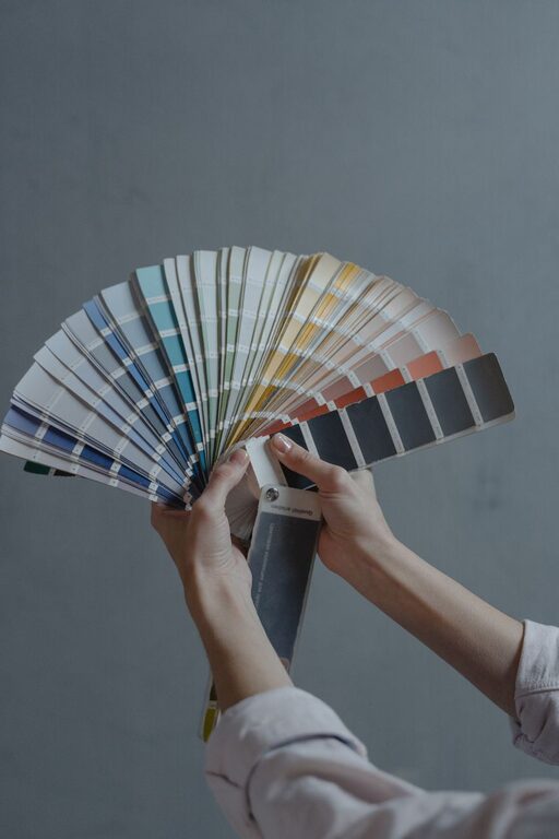
Creating a calm and inviting atmosphere in your home often starts with choosing the right colors. Calm colors can make your space feel more peaceful, relaxing, and balanced—perfect for unwinding after a busy day. But with countless shades and tones available, selecting the ideal colors might feel overwhelming. This guide will walk you through practical tips to help you choose calm colors that suit your style and home.
Why Choose Calm Colors?
Calm colors are typically soft, muted, and subtle. They help reduce stress and promote tranquility, making your home a restful sanctuary. These colors work well in bedrooms, living rooms, bathrooms, and any space where you want to feel relaxed.
Popular Calm Color Families
1. Blues
Blue is often linked with calmness and serenity. Soft blues evoke the sky and water, promoting relaxation and clarity. Light blues and pastel shades work especially well in bedrooms and bathrooms.
2. Greens
Green connects us with nature and growth. Muted greens, like sage or moss, add a fresh but restful vibe. These colors are great for living areas and kitchens.
3. Neutrals
Neutral colors like beige, soft gray, and warm whites provide a peaceful backdrop. They are versatile and allow you to layer other accent colors easily.
4. Soft Pinks and Lavenders
These colors bring a gentle warmth and softness without overpowering a room. They’re perfect for bedrooms and cozy corners.
Tips for Choosing Calm Colors
1. Consider the Lighting
Lighting greatly affects how a color appears. Natural light tends to make colors look brighter, while artificial light can change their tone. Test paint samples on your walls and observe them at different times of day before making a final decision.
2. Use Paint Samples
Don’t rely solely on paint chips or pictures. Buy small sample pots and paint swatches on your walls. Live with the colors for a few days to see how they make you feel.
3. Stick with Muted Tones
Highly saturated or bright colors tend to energize, which is the opposite of calm. Choose colors that are softer, with gray or white added to tone them down.
4. Balance Color with Texture
In calm spaces, textures—like a soft rug, smooth curtains, or woven baskets—can add interest without overwhelming the senses. Pair calm colors with natural materials to enhance the soothing effect.
5. Create a Cohesive Palette
When selecting colors for multiple rooms, aim for harmonious tones that flow well together. This creates a sense of continuity and calm throughout your home.
6. Think About Your Personal Preferences
Calm colors are subjective. What feels soothing to one person may not feel the same to another. Choose colors that you genuinely enjoy and that make you feel relaxed.
Combining Calm Colors in Your Home
Layer with Neutrals
Start with a neutral base on walls or large furniture pieces. This provides a calm canvas to build on.
Add Accent Colors
Use accents in soft blues, greens, or earthy tones for pillows, throws, or artwork. These touches create visual interest without disturbing the tranquility.
Incorporate Natural Elements
Wood, plants, and stone complement calm colors beautifully. They bring nature’s peacefulness indoors.
Avoiding Common Mistakes
– Overusing Dark Shades: Dark colors can feel heavy and less calming, especially in small or poorly lit rooms. Use them sparingly or balance with light accents.
– Ignoring Room Function: Choose calmer colors for spaces meant for relaxation. More energetic or bright colors might be better suited for offices or playrooms.
– Skipping the Test: Color might look different on your walls than on the paint chip. Always test first.
Final Thoughts
Choosing calm colors is about creating a space where you can relax and recharge. By understanding color psychology and testing options in your home, you can find hues that work beautifully with your lifestyle and tastes. Remember, calm colors don’t mean boring—they can be elegant, cozy, and inviting, helping your home become your personal retreat.
Happy decorating!